Guide to universal design in Canvas
Canvas is a teaching platform and an important everyday tool for both teachers and students. It is therefore important to get to know how you can meet requirements for accessibility for a subject, to ensure that everyone can participate.
Course structure
Predictability is important for students. Being able to get an overview and find information about a course quickly means that students can use their time efficiently and not spend it digging for information. A clear and consistent course structure is also a major advantage for anyone for whom navigation is a big problem.
HVL has a resource page for staff about preparing courses that are available via Canvas. See in particular point 2: “Creating structure in the course”, to read about the use of templates via Canvas Commons. Templates have been created for the various departments and study programmes.
Remember to use the right language for the subject, to maintain consistency of language. You can do this via “Settings”, which you can find at the bottom of the subject menu.
Ally - an accessibility tool
Ally is a tool in Canvas that makes it easy for instructors to check if learning material is universally designed. In addition, it gives students the opportunity to download alternative versions of learning material, such as an audio file or an easier-to-read format.
Check accessibility with Ally
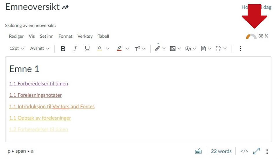
Ally shows a speedometer near the material you add to your course in Canvas. When you write in the text editor in a course, you will see a speedometer directly above the writing field.
Note: We would not recommend using Ally on mobile. Ally does not work in the Canvas app, and is not yet optimized for the web version on mobile.
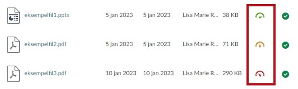
In the module overview and in the file overview, you will also see icons that you can press to check how good the availability is. See our other guides for tips on how to create accessible files.
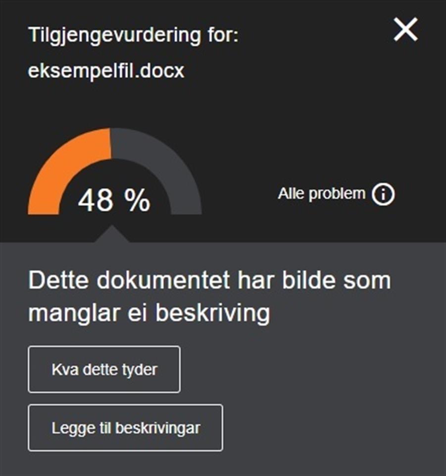
When you press the speedometer, Ally will tell you what can be improved for better accessibility, for example poor contrast between text and background. Some things can be done directly through Ally, other things you have to download/find the file to fix. Ally explains how the problem affects the students, and how you go about fixing it.
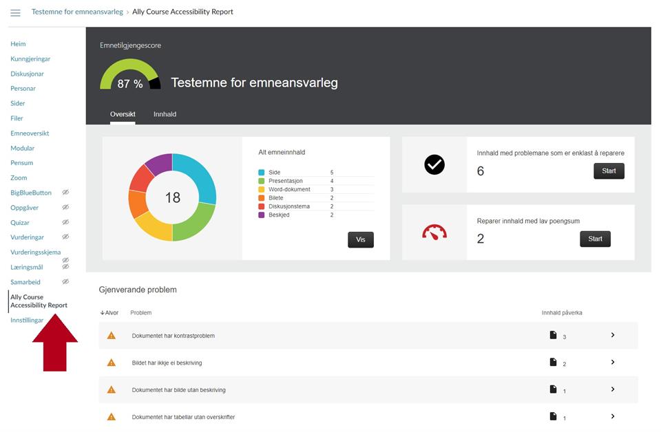
From the side menu of the course you have access to a control panel (Ally Course Accessibility Report) where you can see an overview of how accessible your course is. Here you see the total accessibility score, the range of file types, and what kind of accessibility issues there are. This is a great place to get a overview and see what issues you should work on first.
About alternative formats for students
Students have the opportunity to download files in a subject as an alternative format via this icon:
![]()
These are the formats:
- Marked PDF
- HTML
- ePub
- Electronic braille
- Audio file
- BeeLine Reader
- Immersive reader
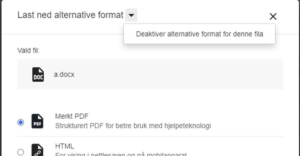
If you wish to remove students' access to the alternative formats on a specific file, you can go to the file, go to alternative formats via ![]() , press the down arrow, and "deactivate alternative formats for this file".
, press the down arrow, and "deactivate alternative formats for this file".
NB! Consider whether this is absolutely necessary as this action removes accessibility tools from the students. Feel free to have a chat with the team for universal design if you have questions about alternative formats or Ally.
Go to the official site for more information about Ally as well as more in-depth tutorials.
Alternative text for pictures
For people using a screen reader (a tool which reads aloud what is on the screen), it is important for the context of pictures in the learning material to be accessible. You can do this quickly and easily by clicking on the picture and selecting “Alternatives for picture”.
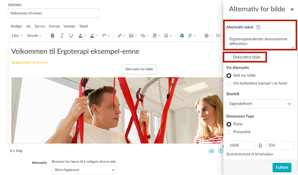
A side window will then appear, giving you several alternatives and options. “Alternative text” and “decorative picture” are alternatives that we will look at here. Remember that a good alternative text includes the most important information, is relatively brief and describes the picture’s theme. In the example here, “occupational therapy student demonstrates lifting equipment” is enough for someone who potentially may not be able to see the picture to understand the content. You can tick the check box for decorative picture if:
- they are already described by text close to the picture
- they act as an illustration to text and do not provide any new information
- they provide visual embellishment such as frames, arrows or other shapes
- they provide decoration for links or buttons to make them stand out
Images with movement
Using images with movement (GIFs) can be an appealing way to make a page more interesting, but be careful with use. Some people can become unwell from repeated movement they cannot pause or stop. Movement will also draw attention away from other information.
Be careful not to use GIFs or videos with fast flashes. More than 3 flashes per second can trigger epileptic seizures.
Headings, font size, lists and links
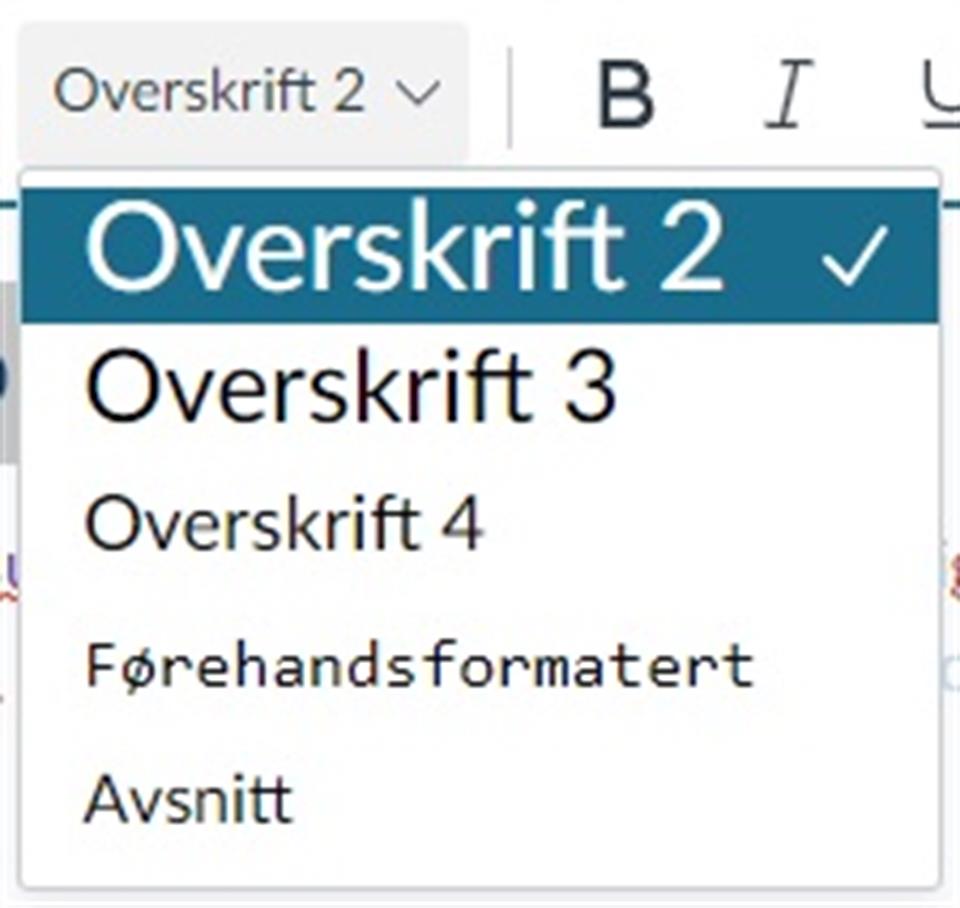
Make sure that you create a good structure and a hierarchy for headings. Use the built-in heading function in Canvas (see the screenshot below). Never use BLOCK CAPITALS as headings or in full sentences, since screen readers read this aloud as shouting.
For paragraphs, you should stick to the standard 12 point font size or bigger. However, it should not be larger than the general headings.
Lists, such as bullets and numbered lists, should be made using the bullet or numbering function.
If you link to content, remember to use descriptive language in the title. It should tell us something about what the link contains. Provide information in brackets or in the title of the link if the reader is being sent to external websites, or if the link will take them to a document.
An example of the use of PDF link in text:

An example of a link that speaks for itself. It can be helpful to say how big the file is if it is needs to be downloaded:

Cut and paste
If you copy text into Canvas from a tool such as Word, the text format will automatically be converted into the Canvas standard. However, it is still a good idea to look through the text to check that it looks correct. Remember to delete unnecessary space between lines, which often comes from Word.