Guide to universal design in Word
Universal design in Word documents includes the use of styles, table structure, colours, language and text alternative for pictures. By setting out to create a document designed for universal access from the start, we can improve the quality of the design.
Structure and styles
The structure provides information about the content of the document, in addition to the visible formatting, and helps to ensure that the content is presented uniformly, by using a range of tools. We create structure by defining the various types of content in the document, such as headings, tables and lists.
- Word and other programs have predefined styles, which provide information about the document’s structure and give it a particular look. Styles maintain the structure when the document is converted into other file formats, such as PDF. We do not create information about the document’s structure by changing the format manually, such as by changing font size and colour.
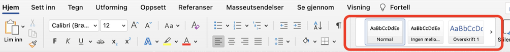
- The heading styles, such as “Heading 1”, “Heading 2” and “Normal” help to create structure in the text. If we use styles rather than manually changing the formatting, the heading will appear in the navigation pane and table of contents. You will also ensure that the content is presented in a clearer format to students who are using tools that read text aloud. If you do not use these styles, but simply change the format, the heading will not appear in the navigation pane or table of contents. Readers using screen reader tools will also not be told whether text is, for example, a heading.
- Note that the “Title” style in Word has no formatting. If you use Title, the text will be read aloud as standard text, and not as the main heading. Our tip is to use “Heading level 1”.
Formatting text
- Use a font type that has a classic style and is easy to read, such as Arial, Calibri or Times New Roman. Avoid unusual font types that might be difficult to read.
- We recommend font size 11 or bigger.
- Wherever possible, avoid using italics or block capitals (CAPS LOCK) in standard text/normal text.
- Use line spacing at least 1.5 times the font size.
- Colours can carry a great deal of meaning, and can create a good general appearance. However, it is important to remember that not everyone can see colours well. If you use colour, it is important to convey the information in other ways. For example, if you colour-code what is correct and incorrect in red and green, you should also use words to indicate correct or incorrect.
- Text boxes often appear as pictures which do not contain alternative text. You should therefore avoid using text boxes.
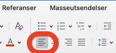
- Use left alignment for text, do not use “justified text”. A straight left margin and irregular right margin make it easier for people to orient themselves in the text.
Lists
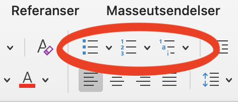
- Lists, such as bullets and numbered lists, should be made using the bullet or numbering function. This helps screen readers, which often have a function that helps people to navigate in lists, for example stating the number of points in the list.
Links
- Links should be descriptive and inform the reader where they are taking them. They should tell us something about what the link contains. Provide information in brackets or in the title of the link if the reader is being sent to external websites, or if the link will take them to a document.
- It can be helpful to say how big the file is if it is needs to be downloaded. Or the length of a video.
- To insert a link, go to “Insert” and select “Link”. Paste the link address into the address field, and the description text in “Text to display”.
- It should also be easy for the user to see the links in the document. In Word, links are automatically underlined, which means that you do not need to add anything, as long as you make sure that the link is in the form of a hyperlink.
- See this picture for an example of text design.

Tables
For people who use aids, it can be very difficult finding their way around and navigating through tables. We therefore recommend that you keep the use of tables to a minimum. If you have to use them, it is important to use the correct markings and use header rows. If you use the table tool, this will create a structured table that it is easy for people to read.
Designing a table:
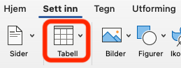
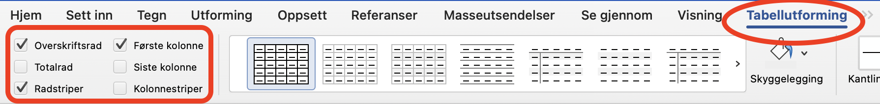
- Use the table tool, “Insert” and then “Table”.
- Define header row and/or first column. When you have finished inserting the table, click anywhere in the table. Click on “Table Design” at the top right of the tools menu, and select what you need for your table. For example, use a header row to highlight the first row if it contains data headings.
- Tables should be designed to be read from left to right.
- There are also banding functions in this tools menu, which create columns or rows of alternating formats. These can help the reader to visually distinguish between rows and columns. Ensure that there is enough of a contrast between font and background, bearing in mind the font colour.
- You can also write a summary, which gives a brief description of what the table contains and what the content is based on.
What to avoid:
- Avoid using the tabulator “Tab” function or the space bar to create something which looks like a table.
- Avoid pasting in pictures of tables. This makes the information inaccessible to people who are using certain aids.
- Avoid creating large tables containing a lot of detail. To make the content easier to read, it is a good idea to split large tables up into multiple smaller tables.
Pictures and illustrations
- If you use pictures and illustrations which contain information, there should be a brief alternative text describing the content of the picture. This allows people who cannot see the picture to understand the content.
- A good alternative text includes the most important information, is relatively brief and describes the picture’s theme.
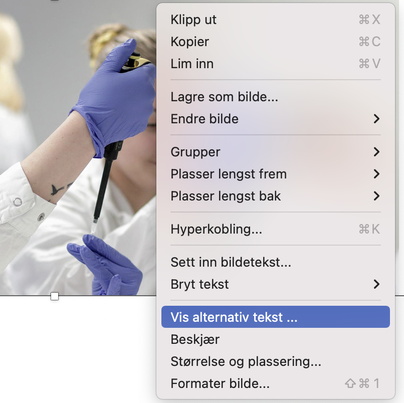
- To enter alternative text, right-click on the picture and select View Alt Text.
- Wherever possible, you should not use a picture of text; write this as text instead. Pictures of text do not communicate the information to people using certain aids.
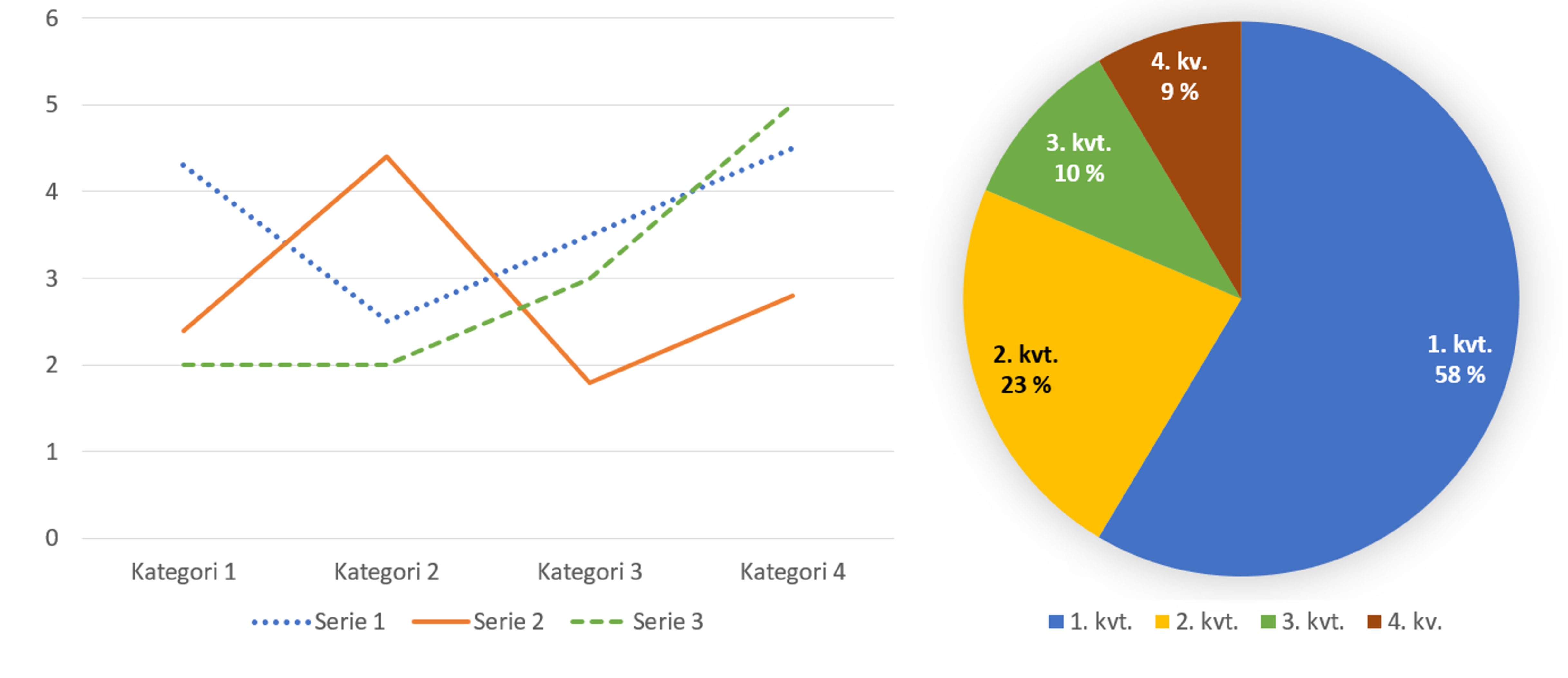
- If you use diagrams, the alternative text should briefly present the purpose and main information in the diagram. You should also present the values in the diagram.
- Illustrations such as diagrams are often designed with colours to convey information. It may be appropriate here to think about colour-blind people or people with colour vision deficiency, who find it difficult to differentiate between certain colours. One way of doing this is to ensure that the information is available via means other than colours.
Pictures do not need to have alternative text, and can be checked off as “decorative” if:
- they are already described by text close to the picture
- they act as an illustration to text and do not provide any new information
- they provide visual embellishment such as frames, arrows or other shapes
- they provide decoration for links or buttons to make them stand out
Language
- State the language in which the text is written, so that the screen reader knows which language to use in order to read the content aloud. You do this by selecting language in Word’s spellcheck tool at the bottom left of the screen.
- Remember to use simple language when providing messages
![]()
General tips
- If you cannot find the function for what you want to do, you can look in the Word toolbar. Go to the search box/help and enter a keyword about what you are looking for, such as “table”.
- Word has its own accessibility tool which checks the document’s accessibility. You can use this as a guideline of the document’s accessibility. It tells you whether the document is accessible, or whether you have to inspect the document, and also gives you tips about changes. You can find this tool at the bottom beside “language”. You can also find it by searching for “accessibility” in the search field at the top in the toolbar.
![]()